Breaking Down Beige
Do You Have the RIGHT Neutrals?
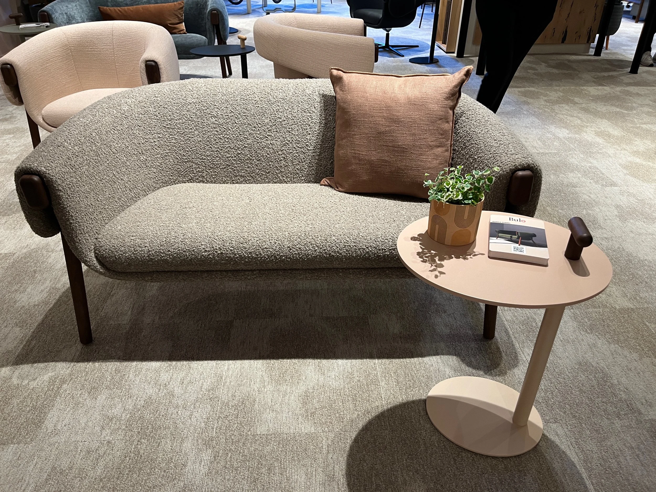
Let’s talk about neutrals. There’s quite a buzz right now about beige. Pantone and several paint companies are forecasting a shift towards warmer beige neutrals and browns. While neutrals—especially beige—never really go out of style, they weren’t discussed as much during the long reign of gray as the go-to neutral. But after what feels like an eternity with gray, there’s now a collective craving for warmth.
This raises an interesting question: does everyone agree on what qualifies as a neutral? What exactly is a “colored neutral”? By definition, a neutral should go with everything, right? But here’s the catch—there are countless nuances within this category. Think of a neutral as any color with its saturation dialed way down. The warm neutrals we’re gravitating towards (not pure grays) all have roots in specific color families. That’s the “secret” to working with neutrals: identifying which color family they belong to. This knowledge helps neutrals harmonize with one another and with other colors.
When I collaborate with clients to develop colors for product lines, I typically start by analyzing their current offerings. The depth of explanation I provide depends on the role of my client contact within the product development process, but I always share my rationale. This analysis often illuminates patterns in their existing colors. Then, I layer in market trends and forecasts to assess whether adjustments are necessary. In the example shown, I had a client in the home interiors category and carefully plotted their neutrals on a color wheel. This wheel, based on a standard color system, represents our perception of the color space while incorporating objective color readings. Examining their colors on this wheel helped identify their placement within color families, chromatic/saturation levels, and lightness values, highlighting overlaps or opportunities for expansion.
Focusing on their beiges and off-whites, I found they were clustered closely in the yellow family. While subtle differences and options are essential for this line, I noticed an opportunity to expand their offerings. Drawing on competitor analysis and my forecasting research, I identified a need for a warmer and more defined shift in neutrals within this product category. My suggestion was to add a new off-white—lighter and slightly more chromatic than their existing options. Using this same approach, I examined and refined other clusters of colors in their lineup and presented suggestions that would take them well into the next several years.
Colorfuel would love to help your company get a handle on your color offering. Whether it’s a small palette or large, neutral or color-filled, having the right color, material and finish makes all the difference in the sales of your product. Not only that, but providing the rationale and evidence to back up the choices and enabling you to share that with your teams throughout the process of product development, that is what leads to success.


